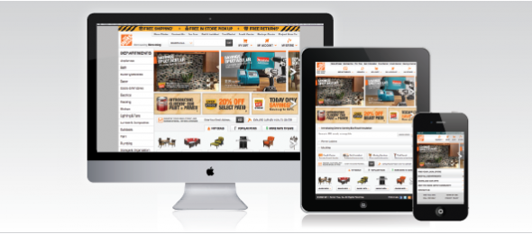
We are now at a point in our Internet world where more people are already accessing our sites through their mobile device than their desktop or will be by next year depending on what statistics you read. What this means for us is we can no longer ignore mobile or use out of the box tools that don’t really work that well or are not that flexible. We need to be creating state of the art sites that are smart enough to know what context they are being viewed in and adapt to that environment. Enter responsive design.
The basic concept of a responsive design is really not that new if you think about it. The print.css stylesheets we have used and loaded for years to create a printer friendly view is a responsive design. It takes content and puts it in a more usable format for how it will be used.
Responsive design operates by building a set of rules and a fluid grid that adapts to the device width it is being viewed on. The rules are built using media queries that apply different styles based on certain conditions being met. Typically the condition we are looking for is the device width.
Along the lines of the print stylesheet you can use media attributes to load stylesheets based on certain conditions such as the following:
<link rel=”stylesheet” type=”text/css” href=”retina.css” media=”only screen and (-we
Here we are testing the device’s pixel ratio and if it comes back as 2 we know that the device has a retina display and we can load a separately stylesheet to serve up higher rez images and treat fonts differently for these devices.
While this is one way to use media queries the more traditional way they are being used are inside the stylesheets themselves. This would look like:
@media only screen and (max-width: 767px) {
nav ul li a {
padding: 10px 0px 10px 10px
text-shadow: 0 1px 0 rgba(0,0,0,0.40);
font-size: 13px;
}
}
In this query we are testing for the device width and then if it is smaller than 767px we are loading a different style for the main navigation links that change the size of the button, the size of the font and have added a nice text shadow effect. This is a basic example and you can nest as many styles inside a single query as you need.
This is just a high level overview of what is possible with responsive design and it will be a driving factor for us at Atech. The ability to create a single codebase that is flexible enough to change on the fly from desktop to tablet to mobile allows us to offer customers a single system with a single base to maintain and a lower TCO for creating sites from desktops to mobile.
In future posts I will cover some of the responsive frameworks available and what adva


